A couple of days ago,
400wcn suggested that I make a tutorial for my post-processing of portraits. I liked that idea, so I'm going to show you how to take a drab, flat portrait and give it a little more oomph! It works in color photos as well.
This tutorial is separated into four sections in case it's getting a little too long for you or you have a different way of going about things. The sections are
Skin Smoothing, Glowy/Contrasty Look, Editing Lighting, and
Eyes. Click on links if you need to know where the tools or options are.
SKIN SMOOTHING
Ctrl+J to duplicate the Background Layer.
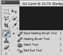
Use the
Healing Brush to rid your subject's face of any blemishes or other glaring imperfections.
Ctrl+J again.
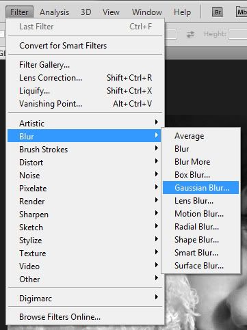
Filter -> Blur -> Gaussian Blur. I used 8.2. It's okay to be heavy-handed. You can always reduce the opacity of the blurred layer until you like how the skin looks.
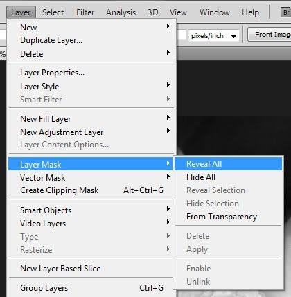
Layer -> Layer Mask -> Reveal All. Or just click on the
gray square icon with the white circle in it on the Layers panel.
Using a soft, round brush on Normal mode, paint black over the areas of the skin you'd like to soften. Be careful not to brush over the nostrils, lashes and whites of eyes, or edges of the lips. If you do, paint back over them with a soft, round white brush. You'll see everywhere you painted getting sharper, so once you're finished, Ctrl+I to invert the layer mask. Now only the areas you WANT blurred will be so. After you've inverted that layer mask, you'll paint white over any additional areas you want to be blurred.
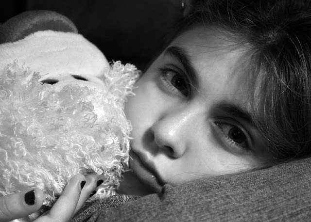 |
| This should be a fairly subtle change. My subject's skin was already smooth, so the change is almost invisible. Try for realistic-looking smoothness. |
GLOWY, CONTRASTY LOOK
Ctrl+Alt+Shift+N and Ctrl+Alt+Shift+E to create a new layer and make a copy of everything underneath it. This is called a stamp. Do this twice, but turn off the top layer.
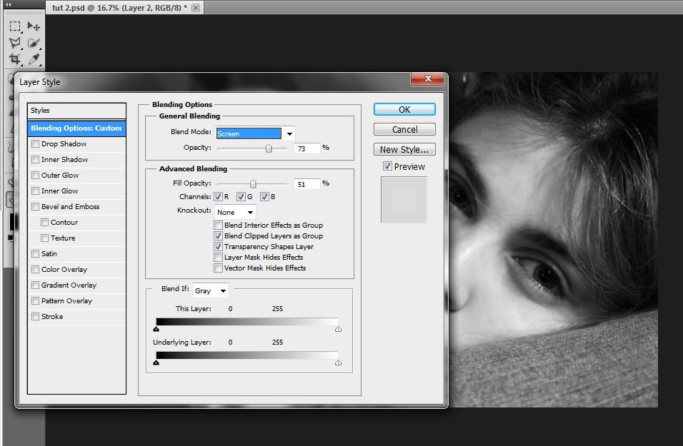
Double-click the first stamp. A screen called
Layer Style should pop up. Under Blend Mode, click the drop-down menu and choose Screen. Lower the Fill Opacity until the subject's skin is brighter but not completely without details such as highlights and shadows. The portrait should seem to glow some.
Once you've clicked OK, turn on and double-click the top layer. Set it to Soft Light and lower the Fill Opacity until you like the contrast. I usually stop somewhere around 50. It's looking better already!
EDITING LIGHTING
Now, create a new stamp layer and add a subtle vignette whatever way you choose to do it. Don't go overboard! There's still something else to do that will slightly darken the edges of the photo too. I just used a huge soft, round brush and
Burned.
Make a stamp OR duplicate the top layer. (I know, it's tedious, but it saves you from a lot of trouble if you realize you didn't like a step and want to go back.) Now we are going to play with the lighting a little.
[optional]
Filter -> Render -> Lighting Effects. Choose which Light Type you want. I usually use Omni, but the default is Spotlight. Move the circle in the
preview around until the brightest spot is where you'd like the most highlights in the photograph. Widen or thin the circle to your preference. Everything outside of the circle will be darkened.
Move the Intensity down to somewhere between 10-14 usually. If Focus is an option, narrow it until it's just highlighting your subject (unless you feel like getting creative). Gloss should be Matte or at least close to Matte (-100), Material should be Metallic (100), and Ambience should be somewhere between 10-30. I'm usually around 14.
The highlights on your subject may be slightly blown out. That's usually the case. Once you push OK, you can add a layer mask and (using a low opacity soft, round brush) get rid of the extra light.
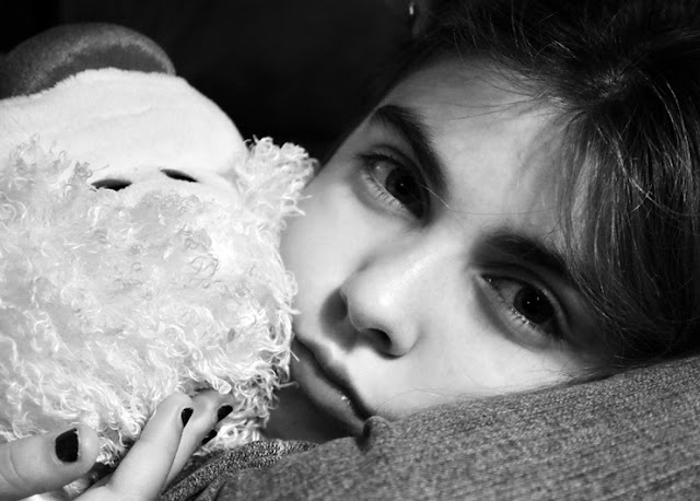
 |
| Another subtle change, but it can make a huge difference if your subject is very poorly lit. If you skipped the Lighting Effects portion this time, always keep it in mind. |
EYES
You guessed it-- make a stamp.
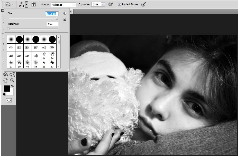
Reduce the size of your soft, round brush so that it will fit inside your subject's eye without going too far over the corners. Then lower the opacity to an extremely small number (depending on how well-lit your photo already is, this can range from 2% to 30%) and change the mode to Vivid Light. You may have to undo a few times before you find the opacity that works for you.
Brush over the whites of your subject's eyes with your brush color set to white. I normally only do the bottom 2/3 of the whites of the eyes so as to keep the shadows from the top lids.
Reduce the brush size even more so that it only fits into the iris (not the pupil). Brush over the areas you really want to stand out more. You may have to do this a few times to get the dramatic look you want.
You may have to make the brush even smaller now. Notice that now the naturally dark rings around the iris are now lightened up a bit too much. Change your brush color to black, lower your opacity to something between 1% and 4% (depending on how light the eyes are), and brush ONLY the dark rings around the irises. DO NOT darken the pupils or else your subject's eyes will look spooky and way too unreal.
Now give your full image a good, hard look. If the eyes look freakish and animalistic, lower the opacity of your eye-edit layer to taste. Brown eyes are particularly difficult.
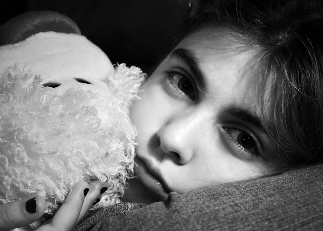
 |
| Notice that the eyes are now brighter and more visible than before. If you want, sharpen the iris and the edges of the eyelids where the lashes are so that the eyes look clearer. They are usually the main focus of the photo, after all. |
VOILA!
Your portrait is finished. How'd it turn out? Did you do anything extra afterward? Feel free to share! I'd love to see your tricks and outcomes. :D


