

Last time, I taught you how to make a very simplistic, basic template using shapes and clipping masks. Now, it's time to spice it up!
Find a texture that you really like and place it over the background layer. I chose this texture by DyingBeautyStock because it seems universal enough for my needs.
If you want to change the color of the texture, you can use whatever method you want. Personally, I'm going to use the non-destructive method of adding a Solid Color fill layer over the texture in whatever color I want and setting its blending mode to Hue. That way I can change the color again any time I want in the future.
Add a layer mask to the rectangle layer. (Layer -> Layer Mask -> Reveal All) Use an interesting brush-- in my case, a grunge brush-- that is black and set to 100% Opacity to brush away the side in whatever fashion you please. Diagonally tends to be most interesting. Vary the opacity and the brush itself to make a fun, unique edge. Don't lose too much, though! You don't want to lost your background photo. If it helps, you can hide the overlapping layers so that you can see more of what you're doing.

Experiment with this method on the other three shapes too, but take care to remember not to mask too much away. Keep your black brush's opacity low.

Just for fun, I'm going to add a thin rectangle across the bottom to add sort of a ribbon effect.

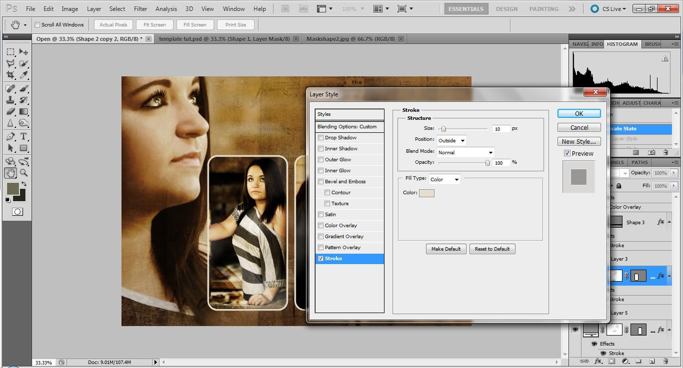
The rest is up to you! Embellish where you want, adding borders or text or even other little shapes to make the template your own. I personally recommend changing the layer styles so that the photos and the background texture will match better. In my case, I changed the blend mode of the main shapes to Hard Light and then added a border called a Stroke to everything, including the ribbon.
I also changed the ribbon's blend mode to Darken and darkened the edges of the whole thing by creating a new layer, using a soft black brush to paint over the edges, and then changing the blend mode until I was satisfied. Here is my finished product minus text.

Remember that text follows the same basic rules as photos: play with the blending options and don't be afraid to experiment with Strokes!!! You can get some very interesting results.
No comments:
Post a Comment